As a photographer do you try to create your 'perfect' image? Do you specialise in a 'comfort' zone or do you experiment and try to push your boundaries when you are behind the camera? However you approach your photography an understanding of what makes the difference between a good photo and a great one is important and could be argued over many a pint, but understanding what it is that makes a photo work for you? That's something we all need to be able to accomplish - to look at a photo and understand what it is that makes it stand out from the crowd for you.
A couple of favourites that I have seen recently appealed to me for completely different reasons. This first one, a landscape by photographer Bill Armsden struck a chord for me. It worked for the simple reason that it is complete. It's foreground, mid-ground and background is a full three course meal. Each one leading on to the next, guiding the 'consumer' to fulfilment; From the lobster pot, with its rope wrapped frame pointing to the boat and the boat aimed neatly at the house, each item fitting into a classic 'rule of thirds' composition. Add in the perfect combination of late summer colours and it works.
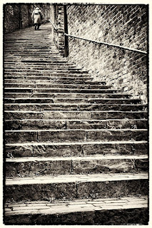
 That first choice was an unusual one for me as I am not a great landscape fan. I tend to prefer images that form part of a story or evoke emotions and this is exactly where my next choice comes in. A picture that a friend, photographer Mike Finley, has recently put up for sale at an exhibition. Entitled 'The Long Climb', it is the perfect 'snapshot' of someone's life. Who is she? Who does she represent? What has she experienced? What was her 'Climb' and where will it end? I think the decision to show it in black and white is just perfect and the rough edge used enhances rather than detracts from the image. Her position on the steps is just perfect too. She clearly has seen a lot of life go by but there is still more to come. I would so love this to be part of a set, with a child at the lower end of the steps but that in itself would raise so many questions. Should it have colour? I would be drawn to a colourful children's dress in yellow with a large daisy print, with the rest in black and white but would have to see it to be sure. It also gives rise to the question should there be an image of a mother with her children halfway up the steps, giving a 'Three Ages of Woman' effect (á la Klimt)? Just the fact that the original image gives rise to these questions is probably enough and if the other images are staged (as they almost certainly would have to be), it would take away from the candid nature of the original shot.
There are a whole set of wonderful images here (click on link) that I could discuss but will leave you to review and comment on below. Personally I love the cleverness of the title, "Mite Walking in Frog Valley" and the 12-18 year old entry (Just how did a 16 year old produce such a perfect example of bokeh?) But I would love to hear your comments.
Mel
